
PROJECT DETAILS
Brief: Menuist was the result of three separate solo projects:
Pair up with another member of the cohort to create a mobile app for each other based on the partner’s needs. I performed user interviews and formulated a problem statement. Low-fidelity wireflow sketches, a research-based Persona, a problem statement, and a task flow were required deliverables.
Expand my research to include multiple user interviews and form a second Persona. I had to create a problem and solution statement for the second user’s needs, and iterate on our original designs to improve functionality. The deliverables for this phase included mid-fidelity wireframes and a second task flow.
I was not required to prototype my frames, but I was able to learn the process on my own and present it to the cohort.
Further iterate on designs, create responsive screens for a second format (iPad), and turn them into high-fidelity prototypes. This phase also required creating a style guide and file organization suitable for handoff to developers.
Project Duration: three separate sprints, each lasting a week.
Tools: Figma (designs, prototype, mobile mirroring), Figjam, Zoom, Loom, Paper Sketches
Role: I was the sole researcher and designer throughout the project. I was responsible for all tasks and deliverables.


user research
After doing two interviews with Geeta, I was able to distill her wants and goals into a problem statement to begin designing for, and transferred her data into a Persona template. During this project, my interest in UX research was ignited, and I was able to apply a number of the methodologies I had learned that week to construct the second Persona: I conducted four user interviews, and created two affinity maps.
key differences between personas:
Geeta had stated that she was a capable cook who didn't require a recipe to prepare what her family enjoyed.
Her major requirements were a visual meal planner, the ability to preserve a list of her favorite dishes, and the ability to create and save a grocery list for use at the store.
Bobby, on the other hand, desired a tool that would allow him to search through meals and pull up a recipe to cook from if necessary.
Before I began sketching, I used the Moscow Method on the data I collected from interviews. I did a competitive/comparative analysis of the New York Times Cooking app, All Recipes Dinner Spinner, and Impossible Foods in order to find inspiration and help define Menuist's initial functions. It was also an opportunity to think about the information architecture of the project I was designing.
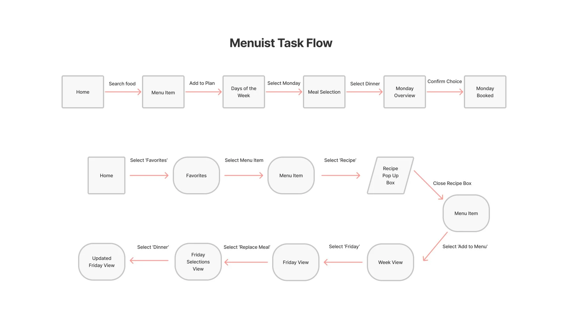
Above are the two task flows my users took. Geeta’s flow is at the top, focused on saving a meal to her menu. Bobby’s flow illustrates utilizing the recipe function and editing his previously saved menu.
challenging concept
One particular hiccup in the design process was reconciling my magical thinking with the real-world implications of the design. Some immediate questions came to mind as I was sketching screens:
If only the ingredient list was shown for a dish, where would the information populate from? Would the user input dishes from scratch, or would they search through a database?
If I were to include recipe and ingredient lists, would I also include the measurements?
If I included measurements, how would the grocery list aggregate - by the amount needed for each recipe, or as a singular item?
Designs: from sketches to high fidelity


My initial wireframe sketches for Phase 1 of tMenuist were very minimal in their design, and the functions were basic. Measurements were not included in the ingredient list and the flows did not account for Bobby’s needs - those frames would come in the second iteration of this project.
second iteration - mid fidelity
Changes made from sketches include revised bottom navigation, improved UX copy, meal difficulty identifiers, and removed gamified confirmation screen
I received great feedback from presenting the project’s first phase and took the critique from Geeta and my peers to iterate my mid-fidelity wireframes. Some of the notes I got involved deciding to include either a hamburger menu or a home icon but not both, to make sure my navigation icons remain consistent throughout my screens, and some aesthetic suggestions for the menu display.
I opted to include some identifying information on the dish pages, based on my research of Geeta’s needs:
cook time
serving info
cleanup details
tag options for sorting
All of this was done to provide the user with as much information as possible without increasing the number of clicks or cluttering the screen. Bobby's task flow was also wireframed, and a recipe instruction pop-up was added to the functionality based on his requirements. On the navigation footer, the Favorites icon remained a heart, but on the dish page, a "+ favorite" button was added as a call to action for populating the Favorites list. The Grocery List symbol was added, while the Menu icon was modified from a calendar to a page design. The hamburger menu was eliminated, but the Home and User Profile icons remained to allow users to manage their accounts.
third iteration - high fidelity
style guide
I had very specific colors in mind when designing my high fidelity screens: red and green. Psychologically speaking, they’re the colors most associated with food. This posed a challenge, however, in that red/green colorblindness would make using my app extremely difficult. Instead, I opted for tones of red that had pink and orange tints and made sure to pick green tones that also had plenty of blue in them. The resulting color palette is not only aesthetically pleasing, but it also adheres to color and contrast accessibility standards.
responsive design
The Menuist design sprint's third phase entailed building responsive screens for a second platform, this time an iPad. To scale up from a mobile device to an iPad, I had to consider how the page layout would alter, as well as adjust the button, box, picture, and text sizes throughout my designs. Because of the larger screen, I realized I needed to rethink how the day and meal boxes are displayed. However, this will be done at a later time.


From start to finish, Menuist was a terrific learning experience. It was my first opportunity to employ UX Research and design thinking, both of which were brand new to me at the time. It was also a fantastic way for me to hone my UI design talents. I'm proud of the work I created and look forward to possibly revisiting it someday.