PROJECT DETAILS
Brief: We had three key objectives:
User research regarding a fitness & wellness products & services marketplace
Design from scratch the prototype for the marketplace
Review prototype to ensure it is aligned with UX/UI best practices & guidelines
Duration: Three weeks
Tools: Adobe XD, Figma, Figjam, Asana, Trello, Google Forms, Jotform, Loom, Paper Sketching, Whimsical
Role: I served as my team’s Project Manager and Facilitator, organizing client meetings and communication. I was the Lead Researcher throughout the sprint and contributed to each stage of the design process. I created mid and high-fidelity wireframes for the Donation, Premium, and Wallet screens, wrote all UX Copy throughout.
a rough start
After a teammate left the project and cohort due to external conflict in the first week of our sprint, the workload of four people landed on the three of us who remained. We were undeterred and pressed on full throttle.
The fact that Adobe XD would not play nice on my computer was the only other evident hurdle for me throughout this design sprint. When I opened the file, it was a regular exercise in futility, and more often than not I received a new love letter on my screen:
user research
My team and I began conducting user interviews in order to collect as much information as possible regarding motivations, goals, and pain points of using a rewards marketplace. We were able to conduct 11 interviews and receive 30 replies to our initial survey. (link)
We each developed an Affinity Map to compare against one another after consolidating our data into "I" statements. I discovered that we categorized information in similar ways, so I kept synthesizing to construct our Personas. Some clear patterns formed and the following users came to light. (click to enlarge)
critical 2nd survey
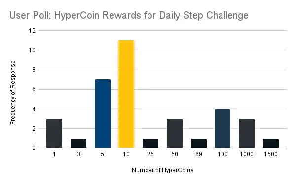
I discovered during our initial user research that we would need to build a value model for HyperCoins, the incentive currency that would be redeemed for rewards in the marketplace. I set out to collect more user opinion data once we had our Personas formed and our problem statement solidified. I formulated more survey questions about reward categories, reward value, and what people thought the worth of HyperCoins should be in dollars.
View the marketplace value survey here
key takeaways from quantitative data
Users prefer cash/gift cards and products over services
Users felt that the dollar value of Hypercoins was either a 1:1 or 1:10 ratio
Users preferred shopping on a light screen over Dark Mode
researching function
competitive & comparative analysis chart
I conducted a detailed screen-by-screen examination of direct competitors to Hypefive, similar health & wellness tracking applications, and existing social media platforms with a marketplace function, in addition to interviewing potential and beta list customers to determine marketplace function. For Hypefive, we utilized the chart above to keep track of the functions we intended to focus on.
We chose not to incorporate the bidding procedure in our marketplace model due to the overwhelmingly negative response we received.
In addition to functionality, I also had to consider what items would be featured in the marketplace. We included questions about reward preferences in all of our user research, and from that data were able to form clear categories and specific items that users would be motivated by. I had six users perform card sorts - three open and three closed - and from that, we had a clear taxonomy for goods in the marketplace.
User Journey Through Hypefive’s Competitors
The Retrospective Journey Map I created show’s our user’s path through rewards programs offered by “other” fitness-related apps.
Product Development - sketches to wireframes
I began sketching and my team moved through low and mid-fidelity wireframing
mid-fidelity usability testing
We were given feedback related to the clickable areas of buttons, text and UX copy, and visibility issues with the glass morphism of our footer.
solution
With a broad range of fitness challenges and events to join, anyone who moves can turn their workout into a reward.
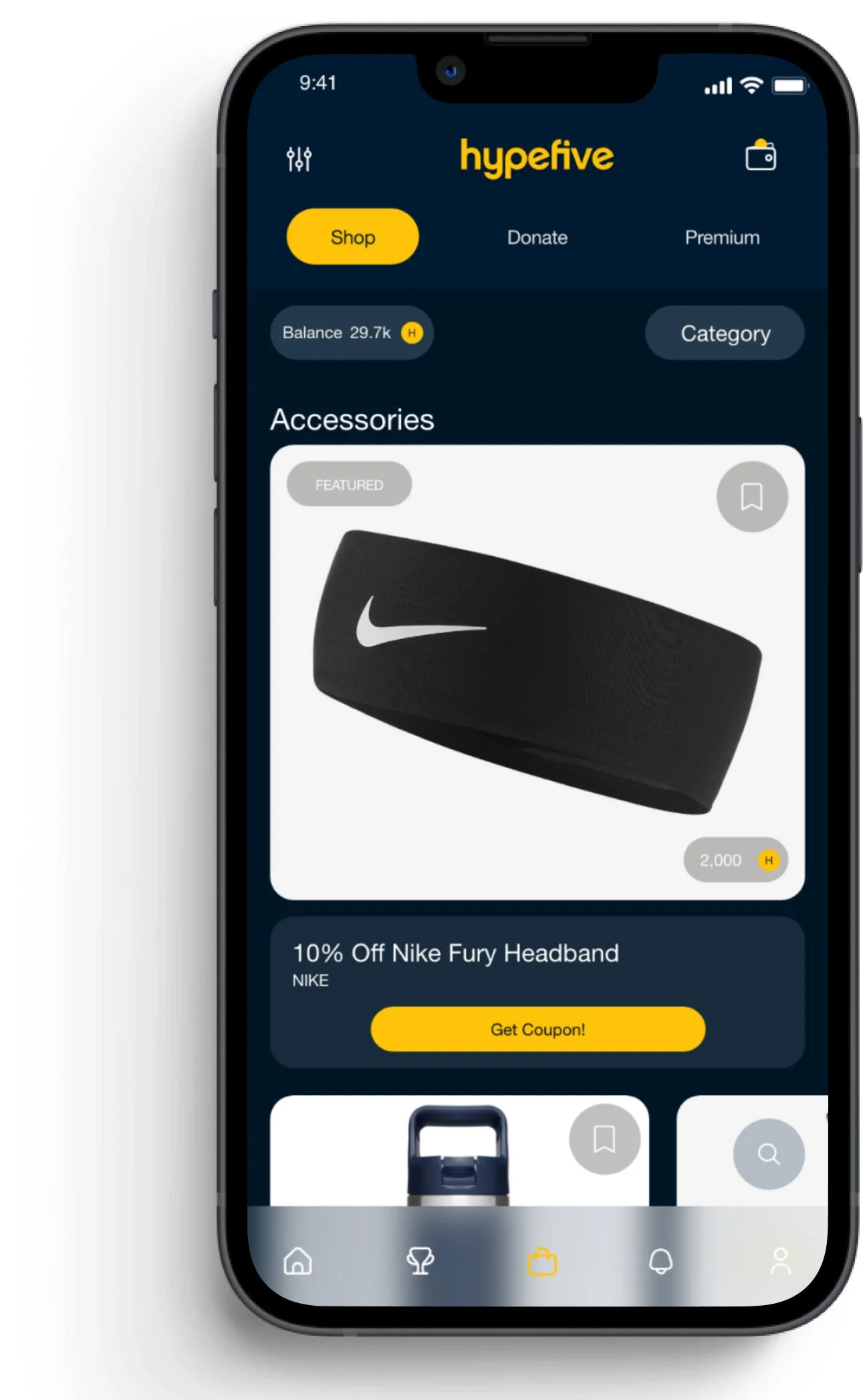
Hypefive’s reward currency, HyperCoins, can be redeemed for a number of premium goods, gift cards, and discount coupons.
Users can donate to charities through the Donation page, track their rewards-earning progress in the Wallet, and scan their redeemed discounts in-store.
proposed edit
Hypefive’s current bottom navigation bar could be further darkened to increase visibility on screens that feature white space.
prototype videos
User navigation through the Premium section to save an item for later and into the Donation screens. We utilized gamification during the redemption process to provide a more positive and engaging experience.
If the user would prefer to redeem their points in-store, they can find a scannable QR code to use at the register.
This video shows how a user would redeem their points and purchase an item online through the app. Gamification elements added to the redemption process provide an element of excitement to the user.
Following Hypefive’s existing design system, the resulting Marketplace screens are in sync with the overall look of the app throughout.
A Better User Journey with hypefive
Our Prospective Journey Map shows Maya experiencing a more meaningful and positive path using Hypefive’s marketplace rewards.


