PROJECT DETAILS
Overview: The Opportunity Project is a design sprint organized by the Census Open Innovation Lab at the US Census Bureau, with executive champions from the White House Office of Science and Technology and the Department of Commerce. I worked with a cross-functional team of 13 consisting of UX Researchers and Designers, Data Analysts, and Software Developers. Our goal was to develop digital tools that use open-source data to assist under-resourced state, local, tribal, and territorial governments navigate potential Environmental Remediation grant opportunities made possible by the Bipartisan Infrastructure Law (BIL).
Project Duration: July - October 2022
Tools: Figma, FigJam, Miro, Trello, Jotform, Zoom, Google products
Role: Lead UX Researcher, UX/UI Designer
user Research
There were three key areas of research that were mapped out to gain insight, in the following order:
Meeting with subject matter experts and user advocates from The Opportunity Project to understand essential elements of grant applications - we acquired resources for terminology, funding sources, and a step-by-step walk-through of an application. No one on our team had ever applied for a federal or state grant before, so we had to establish a baseline understanding of the process.
Survey - using Jotform, I created a 20-question survey to gather basic user demographics, identify their needs and pain points, and offer quantitative and qualitative data. Click here to view the survey.
User Interviews - utilizing social media, we were able to find folks with relevant experience: grant specialists, non-profit applicants, and grant consultants.
KEY TAKEAWAYS
Users tend to use desktop apps and websites over mobile to apply for grants
Users wanted to talk to someone about their application questions
Users wished for a simplistic, centralized place to find grants
PERSONA AND USER JOURNEY
Retrospective User Journey Map
Problem Statement
Finding and applying to environmental remediation grants is an extremely complicated and overwhelming process. Grant applicants need a centralized way to find available grants as well as someone to talk to in regards to their needs and concerns when it comes to grants.
product IDEATION
I began a detailed exploration of competitive and comparative analysis of government-funded grant databases like Grants.gov, Build.gov, Michigan.gov, and mentor-based platforms like ADPList.com, Catchafire.org, and UXCoffeeHours.com to gain insight and inspiration. Our product’s MVP list was formed and we began solving for the How Might We:
volunteer guides
Research participants wanted “someone to talk to” about the grant application process. How could we make that happen?
A number of possible features were considered for this, but ultimately it was decided that connecting grant seekers to volunteer mentors for 1:1 conversations would meet user needs better than an open question forum or other possible connection features.
historical data resources
Another fundamental element of creating the product was utilizing the vast amount of information and resources created and organized by our Data Science team.
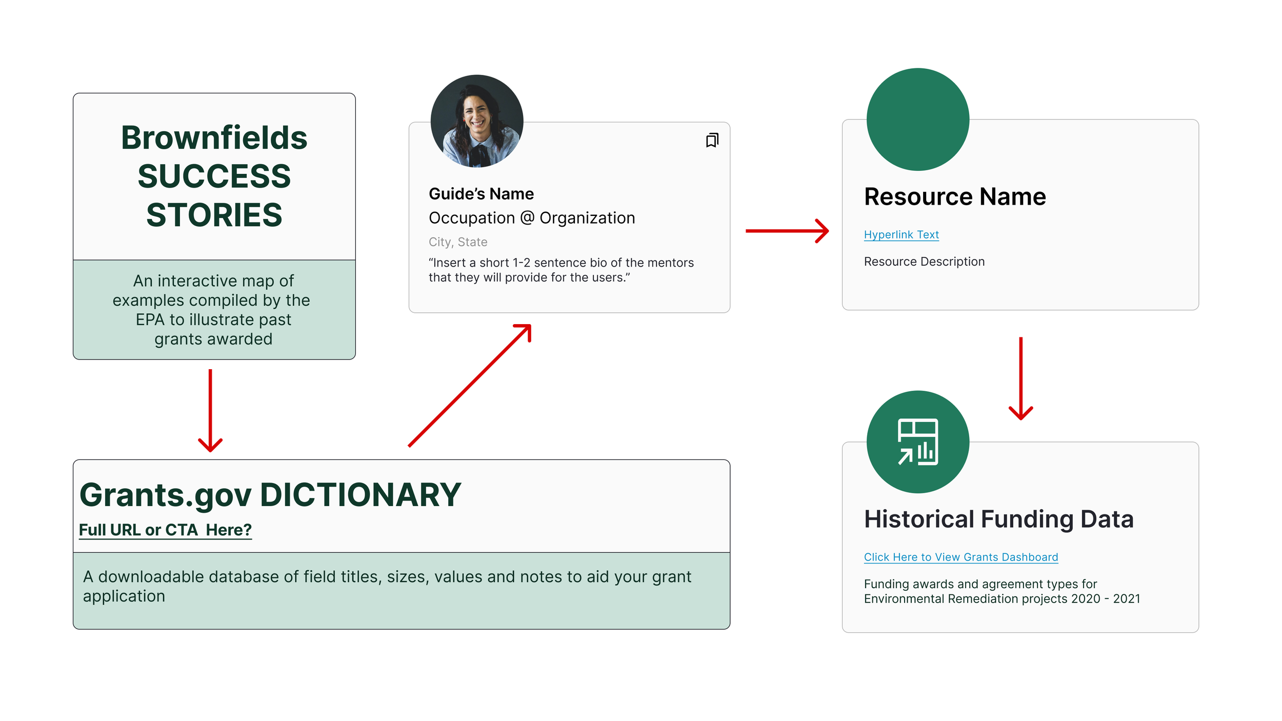
While I performed User Research, they combed through sites like SAM.gov, Grants.gov, and others to pull and sort historical data from successfully funded Environmental Remediation grants, as well as create interactive maps to illustrate the number of Brownfield and Superfund sites throughout Michigan. All of this information had to be included in our designs as one general Resource page that users would then click through. The page also hosts a glossary and dictionary of application terms and examples of past successful applications for reference.
search filter and save options
Based on the grant criteria fields received from the Data Analysts, a list of filtering options was formed for the Find Grants page: funding amount, funding agency, availability dates, and fund-matching requirements. A keyword search option was also included so that users can even spell something incorrectly and be shown grants based on their corrected keyword.
sketching
I was tasked with creating screens for the Messaging feature, the Resources page, the Saved Grants page, and I contributed to the design of the Dashboard page of Grant Guide. Below are some of my initial digital sketches with differing layouts to bring to the team.
mid-fidelity
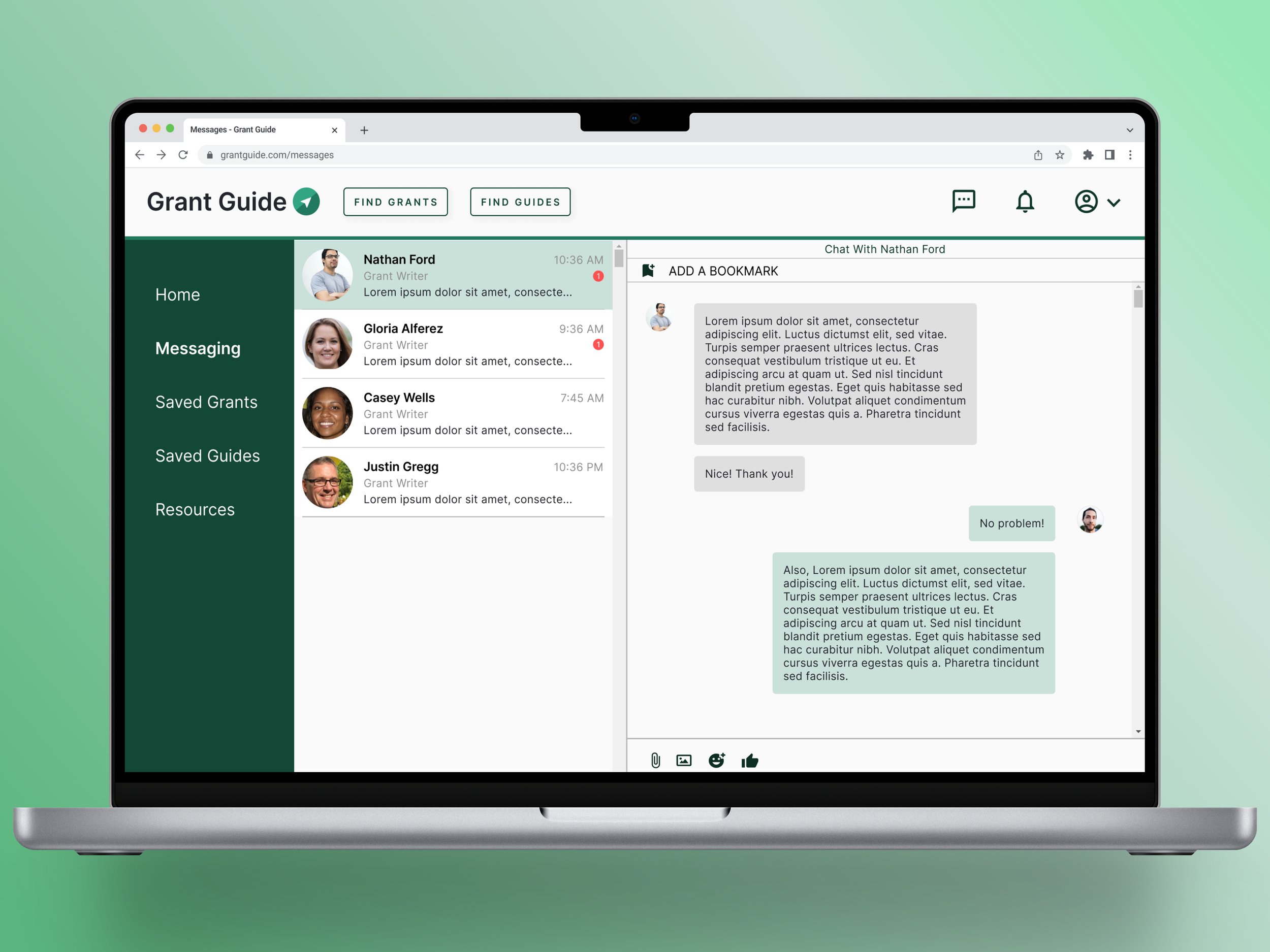
I sketched multiple iterations of the messaging feature. Usability testing helped determine the final formatting.
navigation
As my team began fleshing out the functionality and UI of our screens, we had to address the Navigation elements, to determine where and how the user would access it. We went through a few iterations of the top navigation:
The mid-fi Top Nav designs were assessed during our initial Usability Testing to gauge user preference.
style guide and branding
Once mid-fidelity designs were complete, we moved to create a style guide for Grant Guide.
One of the main design contributions I made was our product’s branding. I used my teambuilding skills to lead several creative exercises to determine the name, logo, and favicon design of our product. I led the team through a word association exercise to create a list of five possible names for our creation. We brought the list to our data and engineering teams to vote on, and we chose my suggestion of Grant Guide as the final name.
I then led a sketching exercise with the design team to ideate our logo and favicon.
rapid iteration
Once we had mid-fidelity screens for a user to click through, Usability Testing began. I reached out to a user that I had interviewed to review and perform tasks with our initial designs while my teammates tested with others. We gained some useful feedback about our initial designs to iterate upon:
Top and side Nav preferences
UI validation
Functionality insight
Examples of the Resources card iterations from mid to high-fidelity. To maintain consistency, I chose to use our Guide card template and applied it to each of the screen’s different clickable elements.
high fidelity prototyping
prototype video
solution: design vs development
Part of working with a cross-functional team is using the guidelines of each other’s skills to create the end product. I leaned on the Engineers to take our prototypes in Figma to a workable desktop app, and there are some differences to Grant Guide that were necessary for its development. We had to work together to determine what features and UI would be prioritized in order to meet our demo deadline. There were several sections of the desktop app that to date have not been built: the Dashboard page, Resources, and Saved Guides.
The main UI differences between our prototypes and the live app are in the navigation and messaging function. The dev team could not format both a top and side navigation, so the top navigation was developed with the necessary CTAs for the three core functions of Grant Guide. Side navigation and additional designed messaging features will be a priority for future iterations.


